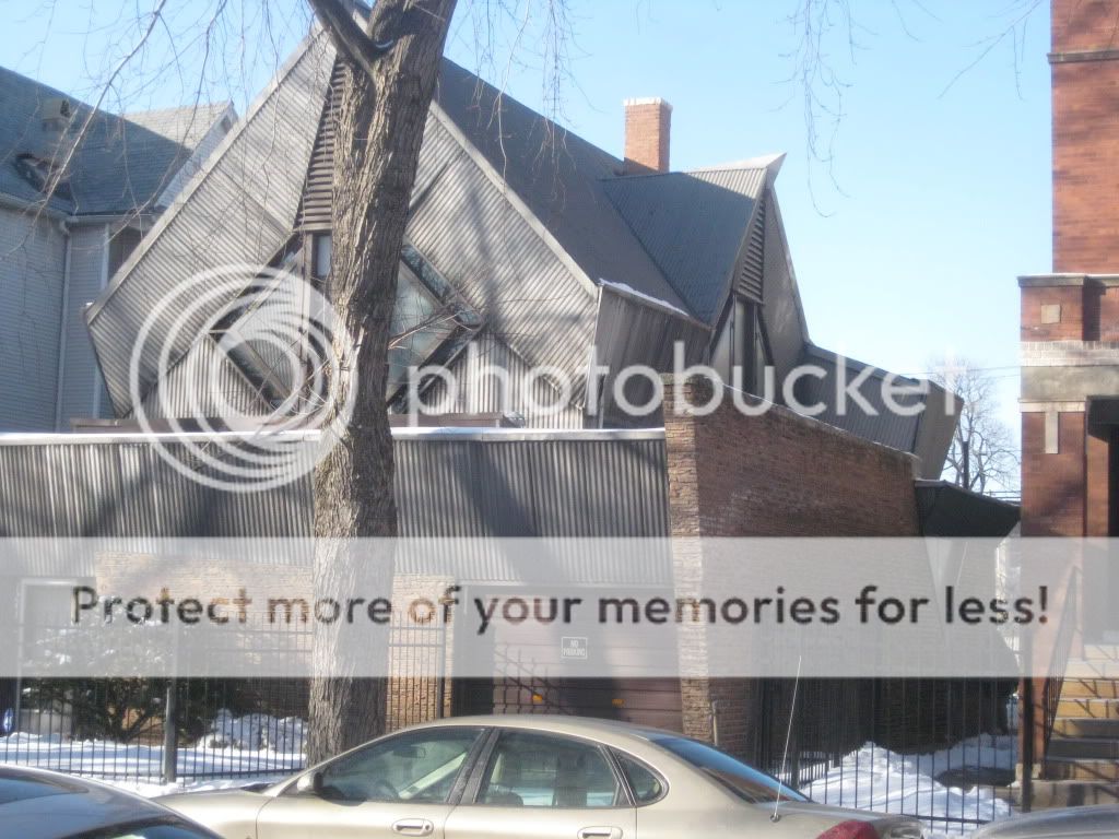
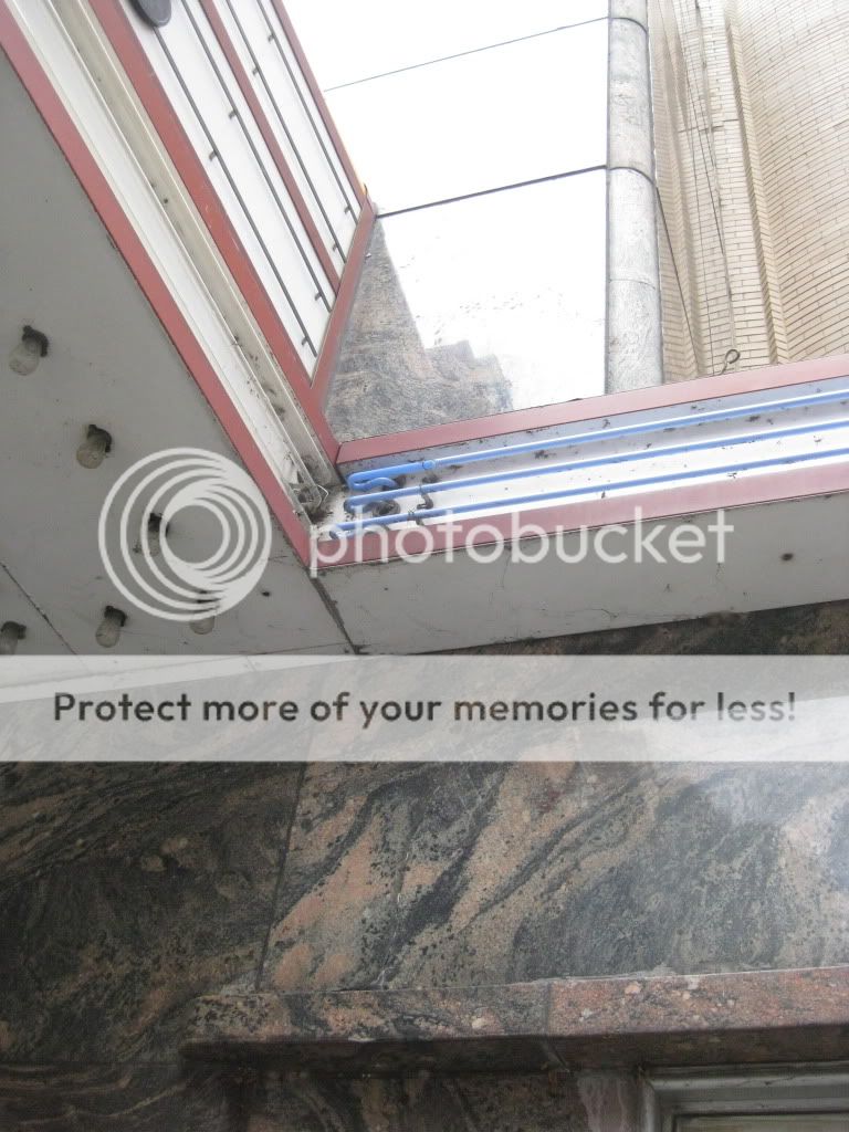
I have a couple of major posts, on projects I'm working on, planned for next week. For now, though, you'll have to make do with yet another random photo post. It's a really cool one, though. Below are photos of the Bachman House, by Bruce Goff. As you probably know, Goff was an extremely eccentric, and extremely talented mid-century architect. His style was completely his own. His work has been referred to as "UFO"-like. What made him great as an architect was his ability to simultaneous balance the specific needs of his clients with his own very personal design explorations. Goff's designs have a tendency to use very unique materials and have very unique forms - but, despite all that, they are extremely functional.
Did you know we had Goff houses in Chicago? Well, he's buried in Graceland Cemetery, not far from Mies (the triangular headstone and green crystal on top match his personality perfectly.) That was my first clue. There are actually two Goff houses. One is the Turzak House located in Edison Park (on the northwest side, almost into the suburbs), and the other, this, is smack dab in the middle of the city, a five minute walk from the Red Line Argyle station, at 1244 W. Carmen. It is actually one of his less crazy, and very little known, works. Built in 1947-1948, it was actually a renovation (or perhaps we could call it a complete reworking) of an existing house that had been built in 1889. Both Goff houses in Chicago are designated Chicago Landmarks. There are several more of his works out in the suburbs.
My favorite part of Goff? He's from Tulsa, just like me :-) so we're kin, kind of. And I've seen some of his work, there, from when he was less than 20 years old, and it's pretty amazing. I'm not gonna lie, a perfect gift for me would be a copy of Bruce Goff: Toward Absolute Architecture by David G. DeLong. But the lowest price for it online is like $175. Sad but true. One day I'll have an attack of spontaneity and buy it anyway.
Sorry the pictures are all kind of the same. There's only one perspective to photograph this house from. And yes, that is unpainted corrugated metal on the facade...
Friday, February 26, 2010
Posted by Posted by
The Loosh
at
7:00 AM
Categories:
0
comments
Tuesday, February 23, 2010
This is a building I know nothing about. It's just kind of a forlorn remnant of Chicago history, but you can see that some effort was made to make it beautiful once upon a time. This is located directly under the Red Line a couple blocks south of the Lawrence station. I would assume it was built when the embankment above it was, about 1920. It looks all to be terra cotta.
Posted by Posted by
The Loosh
at
11:31 PM
Categories:
0
comments
Saturday, February 20, 2010
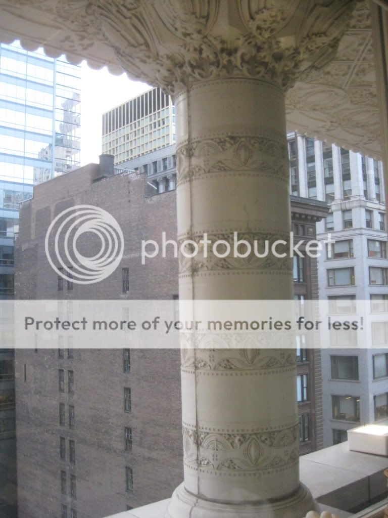
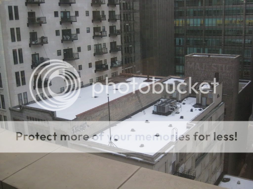
I work behind the cornice level of the Carson Pirie Scott Building on State Street. As you might imagine, you can see some interesting stuff from up there. Here are some shots:
Posted by Posted by
The Loosh
at
8:10 PM
Categories:
0
comments
Tuesday, February 16, 2010
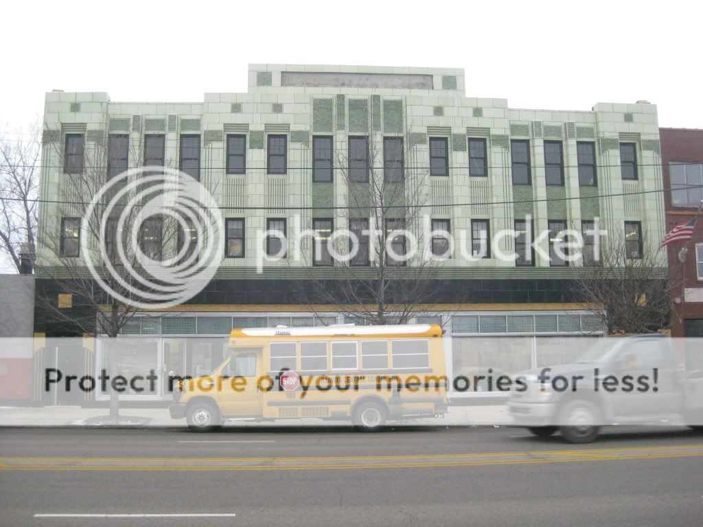
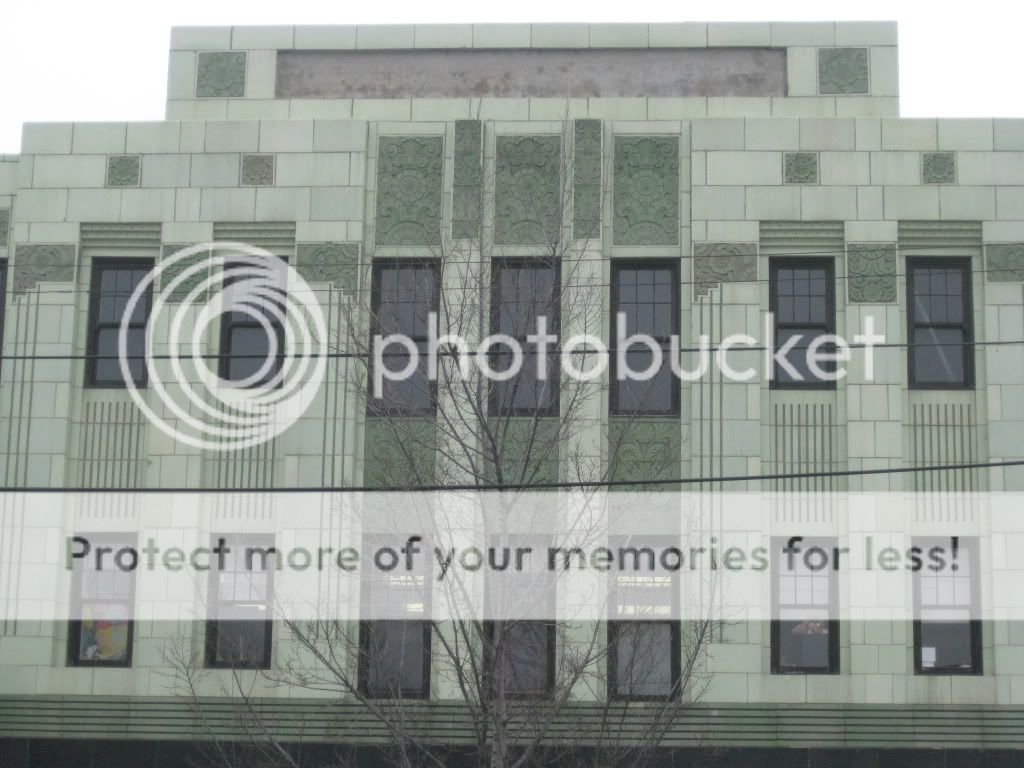
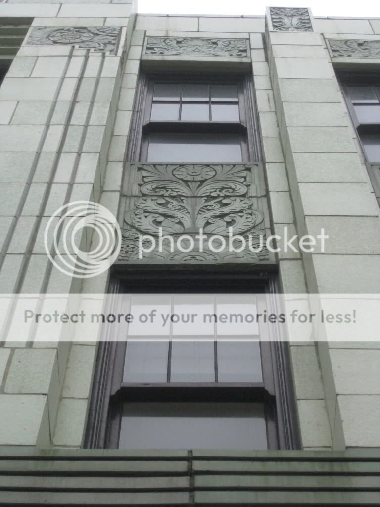
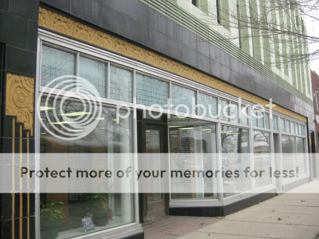
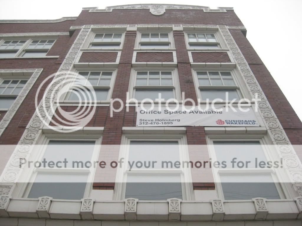
Just down the street from the Overton Hygienic Building is the Chicago Bee Building. It was built by the same man, Anthony Overton, but seven years later, in 1929. It is actually a combination of two buildings, a smaller brick one and a great Art Deco edifice. All the Art Deco ornamentation is rendered in shades of green. From 1929 onward, this building held all of Overton’s businesses, of which the Chicago Bee, one of Chicago’s African-American newspapers, was one. Overton Hygienic, the cosmetics company, continued to be headquartered in this building until the early 1980s. The architect for both the Overton Hygienic Building and this one was Z. Erol Smith, whom I've never heard of - was he an African American architect? There would have been very few of those in the 1920s.
From the 1980s until the mid-1990s, the building was abandoned until the Chicago Public Library stepped in to save it.The first two floors of both pieces of the building were restored and integrated together into the current Chicago Bee Library. It’s a weird location for a library because the Martin Luther King branch is only half a mile away, and given its usage patterns, it’s pretty much a glorified computer lab. Still, I’m glad it’s there because they did a nice job of saving the building.
The Chicago Bee Building is another of the nine buildings that make up the Black Metropolis-Bronzeville City Landmark District, which was created in 1998, and has also been on the National Register since 1986.
Posted by Posted by
The Loosh
at
7:00 AM
Categories:
0
comments
Friday, February 12, 2010
I was down at IIT last week and wandered by this grand old edifice in Bronzeville. I’d heard of it before but never really stopped to look at the details. While I personally like the Chicago Bee Building down the street more, this building is still really nice. A cornerstone building in what used to be “The Stroll,” the grand African American Main Street of Chicago, it is located at 3619-3627 South State Street. The building was built in 1922, commissioned by Anthony Overton, who ran several businesses from within the building, including Douglass National Bank, Victory Life Insurance Company, and the Overton Hygienic Company. Overton Hygienic was one of the biggest-name African American cosmetics companies during the early to mid-20th century and remained in business until the early 1980s. In the later 20th century, Bronzeville fell on hard times, and the building became a 375-bed flophouse. It was recently restored by the Mid-South Planning and Development Commission as an incubator for small businesses. There were lights on in the upper floors but the retail in the first floor is vacant, looking for new tenants.
The Overton Hygienic Building is one of nine buildings that make up the Black Metropolis-Bronzeville City Landmark District, which was created in 1998, and has also been on the National Register since 1986.
Posted by Posted by
The Loosh
at
7:00 AM
Categories:
0
comments
Tuesday, February 9, 2010
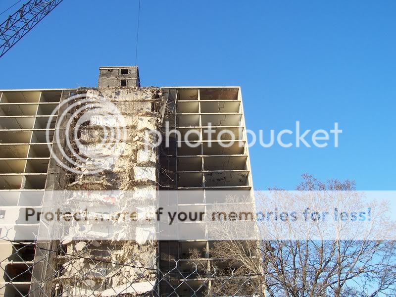
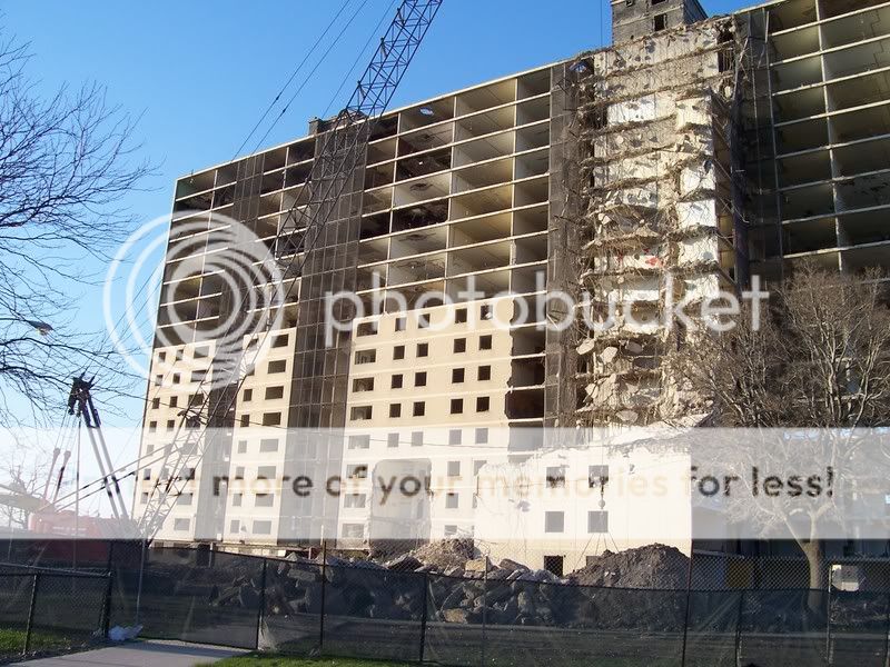
Stateway Gardens, formerly located along State Street from 35th to 39th Streets, was among the most dangerous public housing projects in the city. Before Stateway was built between 1955 and 1958, the area was a low-rise African American community. While not a great neighborhood, it had a grand history near “The Stroll,” and many of its mid-century problems were due the racial covenant policies of the city, which had caused severe overcrowding in the African American districts. Like all public housing, Stateway was built with good intentions, but through both problems of design as well as persistent neglect and disinvestment, the eight sixteen-story highrises became severely run-down. By the 1970s, they were a hot spot for murder and drug sales that not even the police could control. In fact, the police often took part in the problems rather than solved them.
Public housing is a topic I am fascinated with, so you will see more on it on this blog in future posts. For now, enjoy these pictures I took of the demolition of the last building in this complex, in 2007. Note the bright colors a lot of the tenants painted their units – a way to fight the dark conditions that surrounded them in life, perhaps.
Good books to read if you are interested in the history, architecture, and sociology of public housing in Chicago:
Gang Leader for a Day: A Rogue Sociologist Takes to the Streets by Sudhir Venkatesh, 2008.
The Poorhouse: Subsidized Housing in Chicago, 1895-1976 by Devereux Bowly, 1978.
There Are No Children Here: The Story of Two Boys Growing Up in the Other America by Alex Kotlowitz, 1992.
Posted by Posted by
The Loosh
at
10:34 PM
Categories:
0
comments
Friday, February 5, 2010
These are from an article from 1938 in Architectural Forum in which the Esquire Theatre was honored as their Building of the Year.
Front with marquee and unspoiled scallops
Vestibule at front doors. This theatre, like many of its era, touted its cooling system. With modern climate control came the need to keep that climate inside the building.
View of the lobby. What you don't see in this photo is that the colors were salmon, bright blue, and brown. Vibrant and plush.
Second floor hallway (access to the balcony, art gallery, bathrooms.) Circles are a common decorative theme throughout the theatre.
This space is known as the "Little Gallery." Because the Esquire catered to a high-class clientele, it offered them an art gallery in which to relax before and after shows.
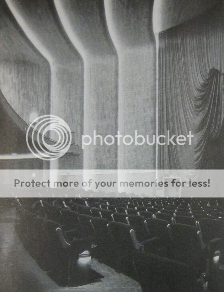
The incredible auditorium. Believe it or not, the Esquire was a movie theatre from the beginning.
A side view of the auditorium, including the balcony.
As with any grand building of its era, the womens' bathroom included a lounge for socializing.
The mens' room, on the other hand, looks surprising uninspired, given the grandiosity of the building. This could easily have been built today.
Posted by Posted by
The Loosh
at
2:12 AM
Categories:
0
comments
Tuesday, February 2, 2010
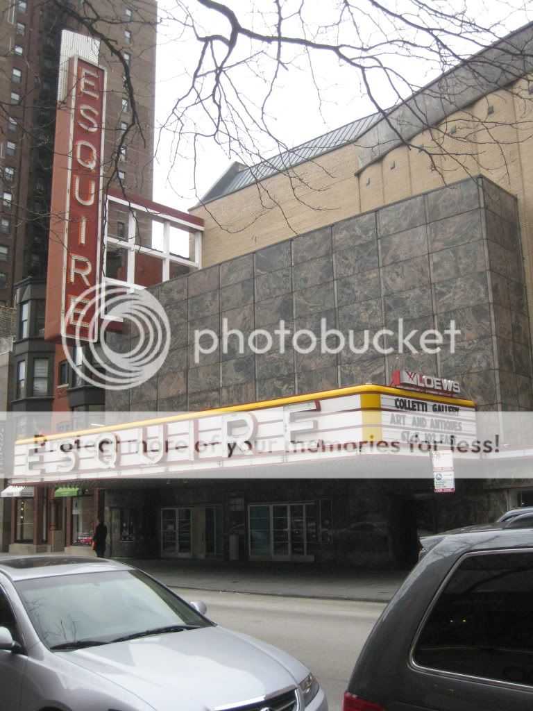
To see a show at the Esquire, a patron would enter through a vestibule meant to keep the climate of the fully air-conditioned theater (a fairly new invention at the time, though Balaban & Katz had air conditioned their theatres as early as 1917) intact, and then into a sweeping lobby that curved around the wall of the single, main auditorium, which was faced in mahogany wainscoting with copper-colored plaster above. At the rear of the lobby rose a grand staircase, carpeted and edged by curving steel railings, leading to a circular overlook above the lobby. Recessed lighting was used throughout, often a blue tint, and highlighted by walls, ceilings, and carpets of salmon, peach, slate, smoke blue, and “cedar” brown. With no windows, it was a closed and fantastic interior wonderland. Curved walls led to unexpected nooks, galleries, and lounges, and circular porthole windows allowed unexpected views.
In its earliest days, the Esquire was considered the city's poshest movie house. Unlike other theaters in the city, it had been built well after motion pictures had entered the mainstream, and so the seating and amenities reflected this, with good sight lines. Its earliest operators played into its prestige by not offering popcorn for sale. Around 1970, it was taken over by Plitt Theaters, and it became a more typical modern movie house, with popcorn and drinks available to a more modest-income crowd, but it still had only one screen. Even given the massive number of seats that had to be sold for one show, it was still successful throughout the 1980s. The theater could have kept being successful for many more years, also, but the owner at the time, M&R Theaters, had other ideas.
In 1986, plans began to circulate that the multiplexing movement that had begun sweeping the metropolitan area was to hit the Esquire. At first, it was to be split into twin screens of 700 seats each, though that number later increased to six much smaller screens. The problem, though, was that M&R wanted to include retail space in the complex, to cash in on the increasingly soaring rents available on Oak Street, onto which the theater faced. Creating retail space would involve a massive reconfiguration of the floor plates and the landlord wanted to alter the facade to allow entrances and display windows for the new retail spaces.
However, in 1983, the city of Chicago had begun the Chicago Historic Resources Survey, which was intended to be a comprehensive list of buildings in the city that had historical or architectural merit and were worthy of preservation. Among the first batch to be surveyed was the Esquire Theatre, and it was rated “Red.” This was the highest possible rating in the survey, held by only 300 buildings in the whole city. As such, the Chicago Commission on Architectural and Historic Landmarks immediately tried to landmark the theater. However, the process was not complete by the time the changes were proposed and M&R Theaters was strongly against the designation. They obtained a demolition permit that they assumed could be used as leverage in a legal suit if the Landmarks Commission forced landmarking over their objection. Partially because of this threat and partially because only one member of the board of the Landmarks Commission was an architect who was willing to stand up for the issues at stake, the Landmarks Commission was willing to work with the developer under the pretense that the building permit would be held up indefinitely if they didn't cooperate. Thus, a compromise was reached. Essentially, the building would be rebuilt, including a replacement of the structure with concrete from the original steel, in return for the facade being retained and the lobby being kept 90% intact. However, the changes necessary on the facade for the addition of retail to the building were allowed.
The architect for the four million dollar renovation was Gelick Foran Associates. Hardly an experienced theater architect, their only other major theater project was the design of the Piper's Alley Cinema. The lack of respect the architect had for history is obvious on the facade of that building, as shown by a large portion of reused fabric from the demolished Louis Sullivan-designed Schiller Theater juxtaposed with the faces of The Second City cast immortalized in the facade of the theater, a parody of the Schiller since that facade included faces of famous Germans. The changes to the Esquire, similarly, show little respect for the grandeur and fabric of the original theater. Aside from the lobby, everything was gutted. In its place, behind the walls of the main auditorium, are two floors of modern retail, with modern storefronts punched through the staid 1930s monolithic brick facade. Some of the original ground floor doors leading to the main auditorium were repurposed as elevator doors. The new theaters, six screens with auditoriums of about 200 seats each, compared to the original 1,200 seats, are on the third and fourth floors. Simple boxes of drywall, they are small, steep, and narrow even by modern theater standards.
On Feb. 4, 1990, the new Esquire Theater reopened, 52 minutes late because the developer had not gotten the fire alarm system correctly certified with the city. Perhaps this should have been an omen of things to come. Through the 1990s, the theater showed art house films, and was fairly successful, though the loss of character in its new auditoriums, in contrast to the lobby that mostly still remained, was well documented in the press. By the early 2000s, the current operator, AMC Loews, was far less careful about which films were picked to be shown there, and the theater was falling into disrepair. This foreshadowed the plans to close the theater in 2006. The retail space remained rented until January 2009, but now lays fallow. In 2008, plans began to circulate that the theater would be demolished for good, and a new retail development would take its place. If it weren't for the severe economic recession that hit in late 2008, the Esquire would be demolished. As of now, it still stands, though sad and forlorn.
The text above is from a paper I wrote on the Esquire recently. You might be interested in a couple of articles I used in my research, which I have uploaded here. One is the article from Architectural Forum in 1938 in which they designate it as their Building of the Year. The other is a scathing review in Inland Architect, from 1991, of the renovation. Most of the rest of the research came from the Chicago Tribune archives.
Posted by Posted by
The Loosh
at
7:22 AM
Categories:
0
comments

